


Hexabot App
Summary (“The short version, for the busy ones.”)
Hexabot is an iOS app for managing multi-purpose robots called Hexabots, designed for people living and working in lunar colonies. The brief arrived at 4:30 pm on February 14th. Seventy-two hours later, a fully designed, wireflowed, and high-fidelity iOS experience was submitted — covering robot status monitoring, task creation, real-time step tracking, voice control, and interrupt flows. The goal: land inside the top 40 and attend the awards ceremony in Milan.
The problem hiding inside a cool brief
The Designflows brief asked for an app that manages Hexabots — autonomous robots assisting humans in lunar colonies. On the surface, it sounds like a fun sci-fi toy. Dig deeper, and a real design challenge emerges.
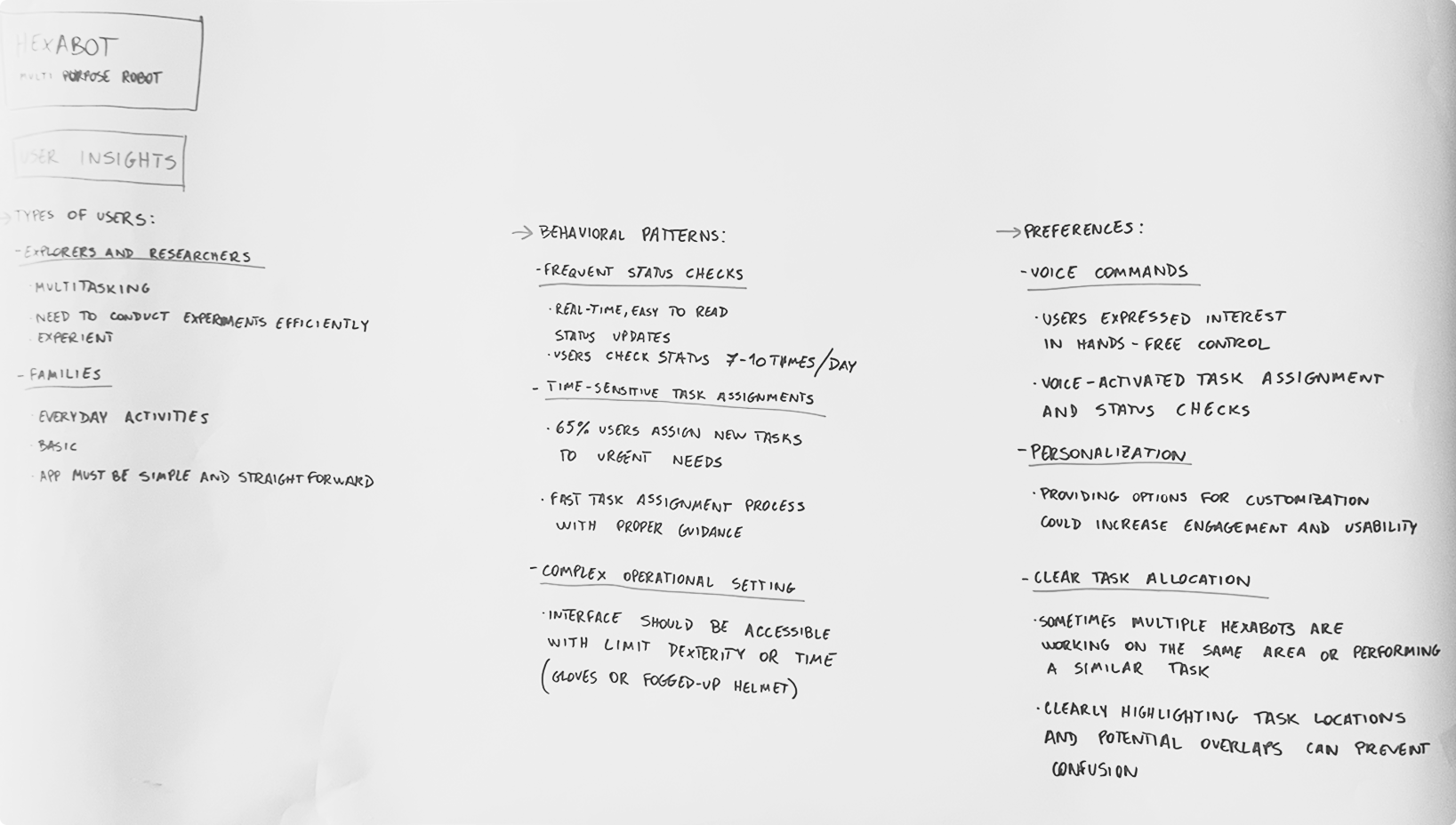
The users aren't office workers glancing at dashboards. They're explorers in suits with fogged helmets, scientists mid-experiment juggling four tasks at once, and families in enclosed habitats relying on these machines to handle labour-intensive or time-consuming chores. Their context is harsh: dexterity is limited, attention is divided, and failure has real consequences.
The specific tension to solve: how do you design a control system that feels fast and powerful for experts, while remaining accessible, readable, and safe for stressed, time-poor users — all within a science-fiction operational setting? Most task-management apps assume users are sitting still, calm, and unencumbered. This one cannot.
Behavioral pattern
Users check robot status 7–10 times per day.
Status must be scannable in under 2 seconds, even through a visor.
Critical stat
65% of users assign new tasks in response to urgent needs — the task creation flow must be fast, structured, and low-friction.
Physical constraint
Gloves and limited dexterity demand large touch targets, high contrast, and minimal multi-step interactions.
Multi-bot complexity
Multiple robots sometimes work in the same zone. Clear task allocation prevents confusion and potential collision errors.
What the design had to achieve
The objective was shaped by both the competition criteria and the users uncovered during early research. The brief required a wireflow plus several high-fidelity screens for iOS — but winning meant going beyond compliance and demonstrating real design thinking.
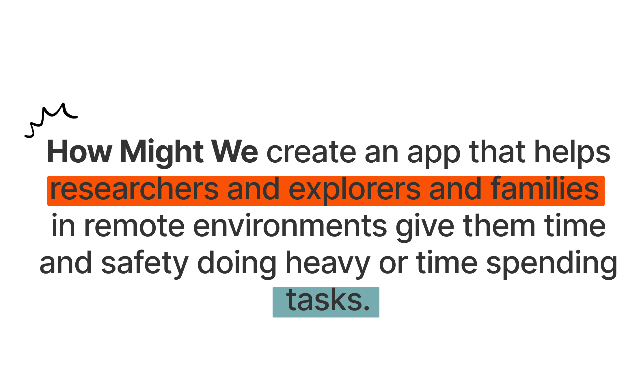
The design objective was set as a "How Might We" statement:
Three design principles emerged from this statement and guided every decision:
Clarity over cleverness
Status, tasks, and actions must be readable at a glance — even under cognitive load or physical constraint. High contrast, large touch areas, and unambiguous labelling are non-negotiable.
Flexibility without chaos
Users must be able to create new tasks, pause current ones, and reassign priorities without losing context. The system adapts to urgency — not the other way around.
Accessible by design, not as an afterthought
Voice control, large buttons, and visual hierarchy serve all users — from the seasoned explorer to the non-technical family member — in an environment that cannot afford confusion.
Three days, one complete product
With 72 hours on the clock, process had to be fast but deliberate. Time was split into three rough phases: research and framing, wireframing and flow design, and high-fidelity execution.
Moodboarding and visual direction — finding the language
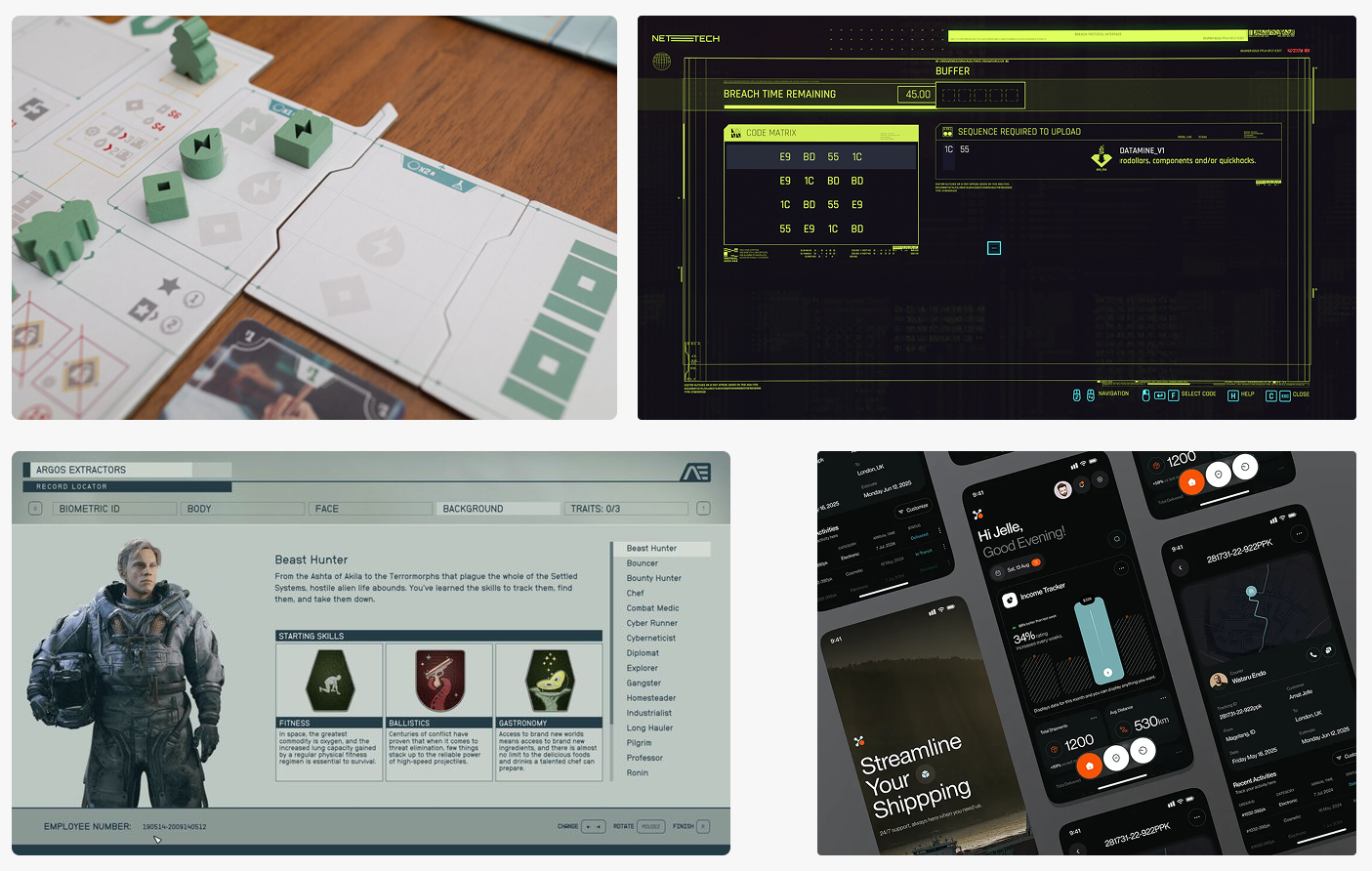
A tight reference board was assembled, mixing Cyberpunk 2077's terminal UI aesthetic, board game layout thinking from Salton Sea, the robot character design lineage from Pixar's The Incredibles, and the dense-yet-readable spatial UI of Starfield. The goal was not to replicate any of these — but to distil a tone: industrial, utilitarian, serious, with warmth and clarity.
Digital wireflow — architecture made visible
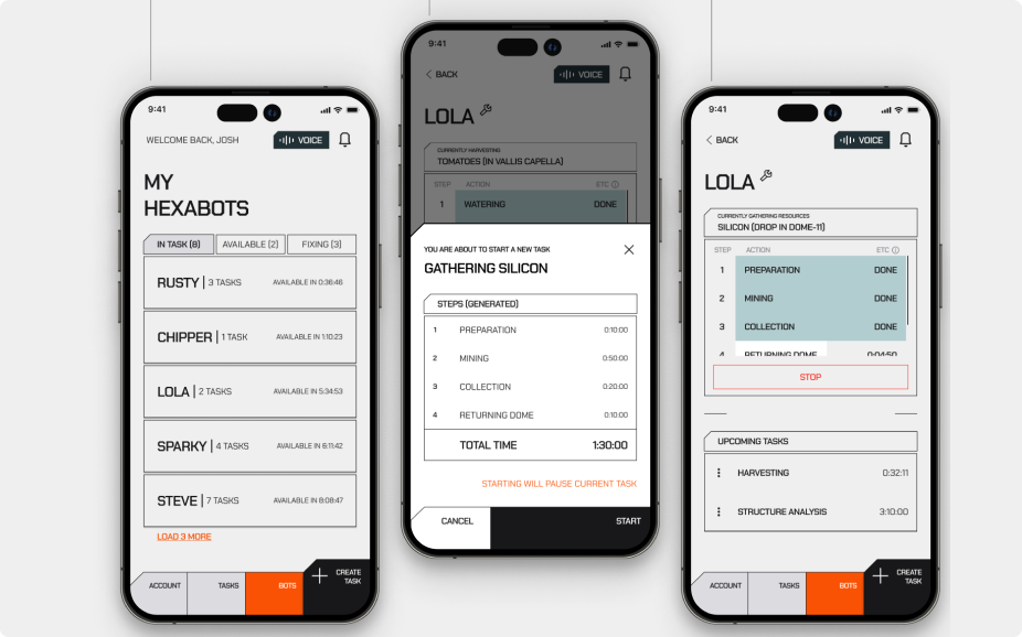
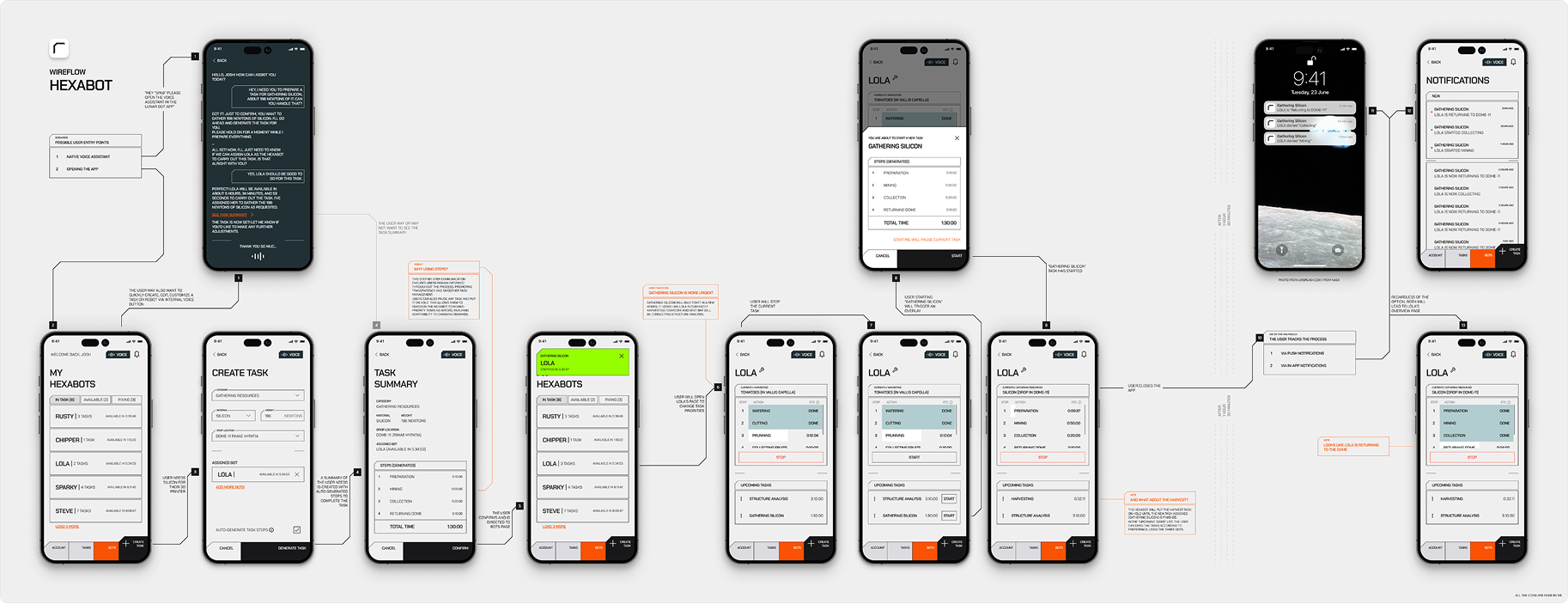
A full wireflow was built showing every screen state: the bot list, task creation, task confirmation modal, active control page, upcoming task queue, notification layer, and interrupt flows. Annotations documented the design rationale at each decision point.
High-fidelity UI — executing the visual language
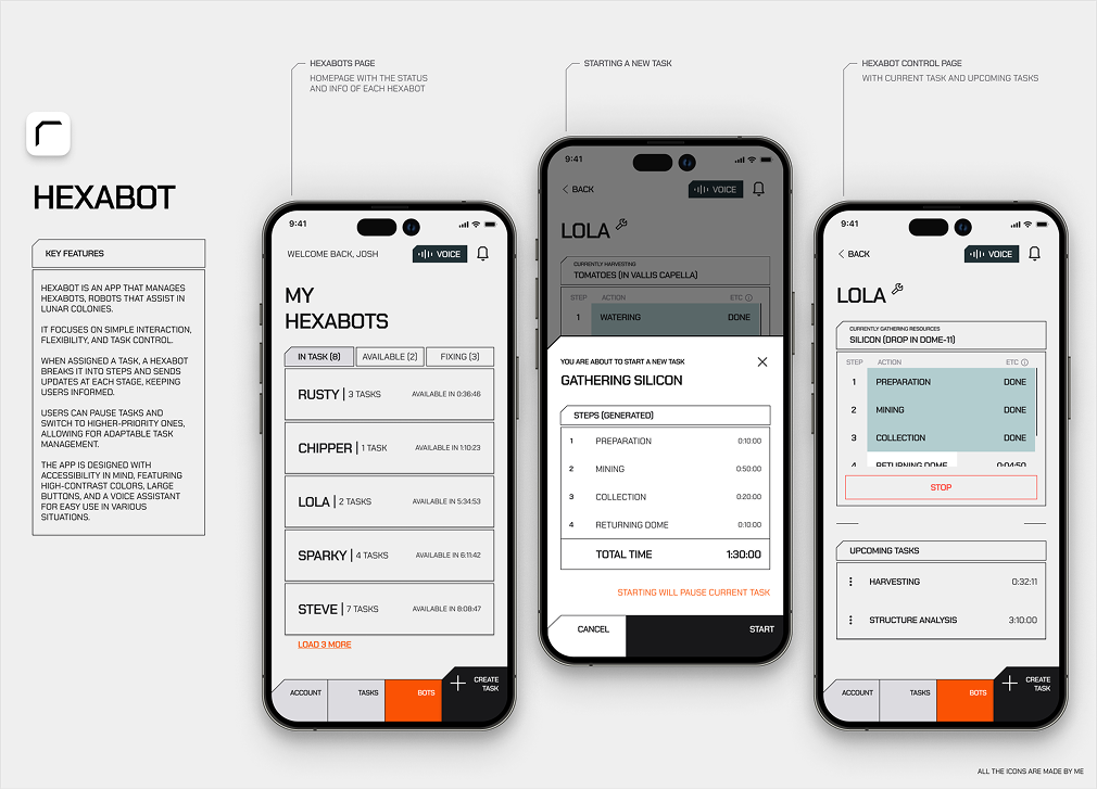
The final screens used a near-black background with an orange accent (#e85a00) for actionable elements and critical status. Monospace typography provided the industrial precision. High-contrast colour coding (grey = done, teal = in progress, orange = warning/stop) made status scannable. Every icon in the app was custom-made — no icon library shortcut.
Art Direction Note
The Salton Sea board game was a particularly important reference — not for its visual style, but for how it organises complex, parallel information across a physical space. Board game design solves for multi-actor states, limited information real estate, and split-attention environments. These are exactly the conditions a lunar colony app faces. That thinking directly influenced the tabbed status view (In Task / Available / Fixing) and the step-progress table within each robot's control page.
UX/UI Design Note
The voice button is persistent across all screens — not buried in settings. In a gloved-hand environment, voice is not a nice-to-have. It is the primary interaction for many users. Placing it in the top-right corner of every view (next to the notification bell) makes it contextual and instantly reachable. This is a rare case where accessibility and the primary user journey are the same thing.
What success looks like
In a competition context, success is partly about scores and rankings — but the more interesting measure is whether the design solves the stated problem in a way that feels considered and real.
The competition objective was clear: reach the top 40 and earn an invitation to the awards ceremony in Milan. Beyond the ranking, success for this project means delivering a product experience that holds up under scrutiny — from the clarity of the wireflow to the precision of the visual system.
Reflection
Competing in Designflows 2025 was a genuine test of creative endurance. The 72-hour window forces you to make fast decisions and live with them — which, ironically, produces more authentic design than weeks of endless iteration. The constraint of the brief (design for a science-fiction world, but make it real and usable) was exactly the kind of tension worth spending three days with. Whatever the final ranking, this was worth every hour.

Rui B
2026
Made in Porto

Handle with care

Hexabot App
Summary (“The short version, for the busy ones.”)
Hexabot is an iOS app for managing multi-purpose robots called Hexabots, designed for people living and working in lunar colonies. The brief arrived at 4:30 pm on February 14th. Seventy-two hours later, a fully designed, wireflowed, and high-fidelity iOS experience was submitted — covering robot status monitoring, task creation, real-time step tracking, voice control, and interrupt flows. The goal: land inside the top 40 and attend the awards ceremony in Milan.
The problem hiding inside a cool brief
The Designflows brief asked for an app that manages Hexabots — autonomous robots assisting humans in lunar colonies. On the surface, it sounds like a fun sci-fi toy. Dig deeper, and a real design challenge emerges.
The users aren't office workers glancing at dashboards. They're explorers in suits with fogged helmets, scientists mid-experiment juggling four tasks at once, and families in enclosed habitats relying on these machines to handle labour-intensive or time-consuming chores. Their context is harsh: dexterity is limited, attention is divided, and failure has real consequences.
The specific tension to solve: how do you design a control system that feels fast and powerful for experts, while remaining accessible, readable, and safe for stressed, time-poor users — all within a science-fiction operational setting? Most task-management apps assume users are sitting still, calm, and unencumbered. This one cannot.
Behavioral pattern
Users check robot status 7–10 times per day.
Status must be scannable in under 2 seconds, even through a visor.
Critical stat
65% of users assign new tasks in response to urgent needs — the task creation flow must be fast, structured, and low-friction.
Physical constraint
Gloves and limited dexterity demand large touch targets, high contrast, and minimal multi-step interactions.
Multi-bot complexity
Multiple robots sometimes work in the same zone. Clear task allocation prevents confusion and potential collision errors.
What the design had to achieve
The objective was shaped by both the competition criteria and the users uncovered during early research. The brief required a wireflow plus several high-fidelity screens for iOS — but winning meant going beyond compliance and demonstrating real design thinking.
The design objective was set as a "How Might We" statement:
Three design principles emerged from this statement and guided every decision:
Clarity over cleverness
Status, tasks, and actions must be readable at a glance — even under cognitive load or physical constraint. High contrast, large touch areas, and unambiguous labelling are non-negotiable.
Flexibility without chaos
Users must be able to create new tasks, pause current ones, and reassign priorities without losing context. The system adapts to urgency — not the other way around.
Accessible by design, not as an afterthought
Voice control, large buttons, and visual hierarchy serve all users — from the seasoned explorer to the non-technical family member — in an environment that cannot afford confusion.
Three days, one complete product
With 72 hours on the clock, process had to be fast but deliberate. Time was split into three rough phases: research and framing, wireframing and flow design, and high-fidelity execution.
Moodboarding and visual direction — finding the language
A tight reference board was assembled, mixing Cyberpunk 2077's terminal UI aesthetic, board game layout thinking from Salton Sea, the robot character design lineage from Pixar's The Incredibles, and the dense-yet-readable spatial UI of Starfield. The goal was not to replicate any of these — but to distil a tone: industrial, utilitarian, serious, with warmth and clarity.
Digital wireflow — architecture made visible
A full wireflow was built showing every screen state: the bot list, task creation, task confirmation modal, active control page, upcoming task queue, notification layer, and interrupt flows. Annotations documented the design rationale at each decision point.
High-fidelity UI — executing the visual language
The final screens used a near-black background with an orange accent (#e85a00) for actionable elements and critical status. Monospace typography provided the industrial precision. High-contrast colour coding (grey = done, teal = in progress, orange = warning/stop) made status scannable. Every icon in the app was custom-made — no icon library shortcut.
Art Direction Note
The Salton Sea board game was a particularly important reference — not for its visual style, but for how it organises complex, parallel information across a physical space. Board game design solves for multi-actor states, limited information real estate, and split-attention environments. These are exactly the conditions a lunar colony app faces. That thinking directly influenced the tabbed status view (In Task / Available / Fixing) and the step-progress table within each robot's control page.
UX/UI Design Note
The voice button is persistent across all screens — not buried in settings. In a gloved-hand environment, voice is not a nice-to-have. It is the primary interaction for many users. Placing it in the top-right corner of every view (next to the notification bell) makes it contextual and instantly reachable. This is a rare case where accessibility and the primary user journey are the same thing.
What success looks like
In a competition context, success is partly about scores and rankings — but the more interesting measure is whether the design solves the stated problem in a way that feels considered and real.
The competition objective was clear: reach the top 40 and earn an invitation to the awards ceremony in Milan. Beyond the ranking, success for this project means delivering a product experience that holds up under scrutiny — from the clarity of the wireflow to the precision of the visual system.
Reflection
Competing in Designflows 2025 was a genuine test of creative endurance. The 72-hour window forces you to make fast decisions and live with them — which, ironically, produces more authentic design than weeks of endless iteration. The constraint of the brief (design for a science-fiction world, but make it real and usable) was exactly the kind of tension worth spending three days with. Whatever the final ranking, this was worth every hour.
Rui B
2026
Made in Porto
Handle with care