


RevSync — Syncing cold data into warm conversations
Summary (“The short version, for the busy ones.”)
Designed the RevSync brand from the ground up:
-strategy, identity, visual language - using a cold-to-warm concept where blue fragments become lime-green solids.
Built the complete information architecture, wireframes, and mid-fidelity screens to align with stakeholders before moving to production. Created a full UI kit and implemented the final website directly in Figma Sites — fully responsive, production-ready, and fast. Set up additional performance tracking from launch day.
The site hit 15,000 unique visitors in its first 3 months. The visual system - especially the typographic "link shapes" - became the backbone of the brand's infographic storytelling across pages.
Complex infrastructure, invisible to the eye
RevSync operates in a space where the product is, by nature, invisible. There are no physical goods, no dashboards the user immediately experiences, no single compelling screenshot. What RevSync sells is architectural integrity — the confidence that your revenue infrastructure is not stitched together with spreadsheets and crossed fingers.
The core tension was this: the people who most need RevSync are the hardest to convince they need it. They're running teams, closing deals, managing inboxes. Telling them their "system is broken" when things are moving — even chaotically — is a hard message to land.
Design a brand that demonstrates systems thinking
The objective was clear but demanding: build a visual identity and website that didn't just describe RevSync's capabilities — it had to embody them. The brand itself needed to feel like a system: structured, coherent, scalable, and confident.
Specifically, the goals were:
Translate abstraction into a compelling visual metaphor
Cold data → warm conversations had to be visible in the brand, not just in the copy. Color, form, and motion all needed to carry that narrative.
Build trust from the first scroll
B2B buyers scrutinize credibility. The brand had to signal depth of expertise and professionalism before a single word was read.
Design a system, not a collection of pages
Every element — typography, spacing, shape language, color — needed to be reusable and scalable into infographics, presentations, and collateral beyond the website.
Deliver a production-ready website with measurable traffic
Beyond aesthetics, the deliverable was a fully working, responsive, tracked website — not a prototype handed to a developer.
From concept to production in five phases
The project was structured in deliberate phases — each one a gating checkpoint before the next. This wasn't arbitrary process; it was itself a demonstration of systems thinking applied to the design discipline.
Brand Strategy — the cold-to-warm concept
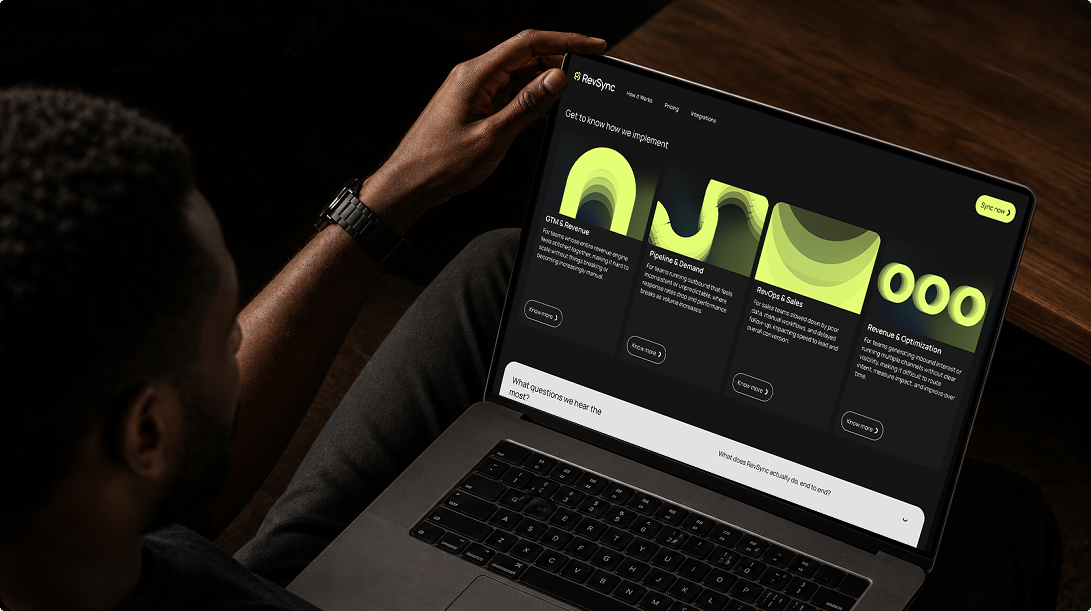
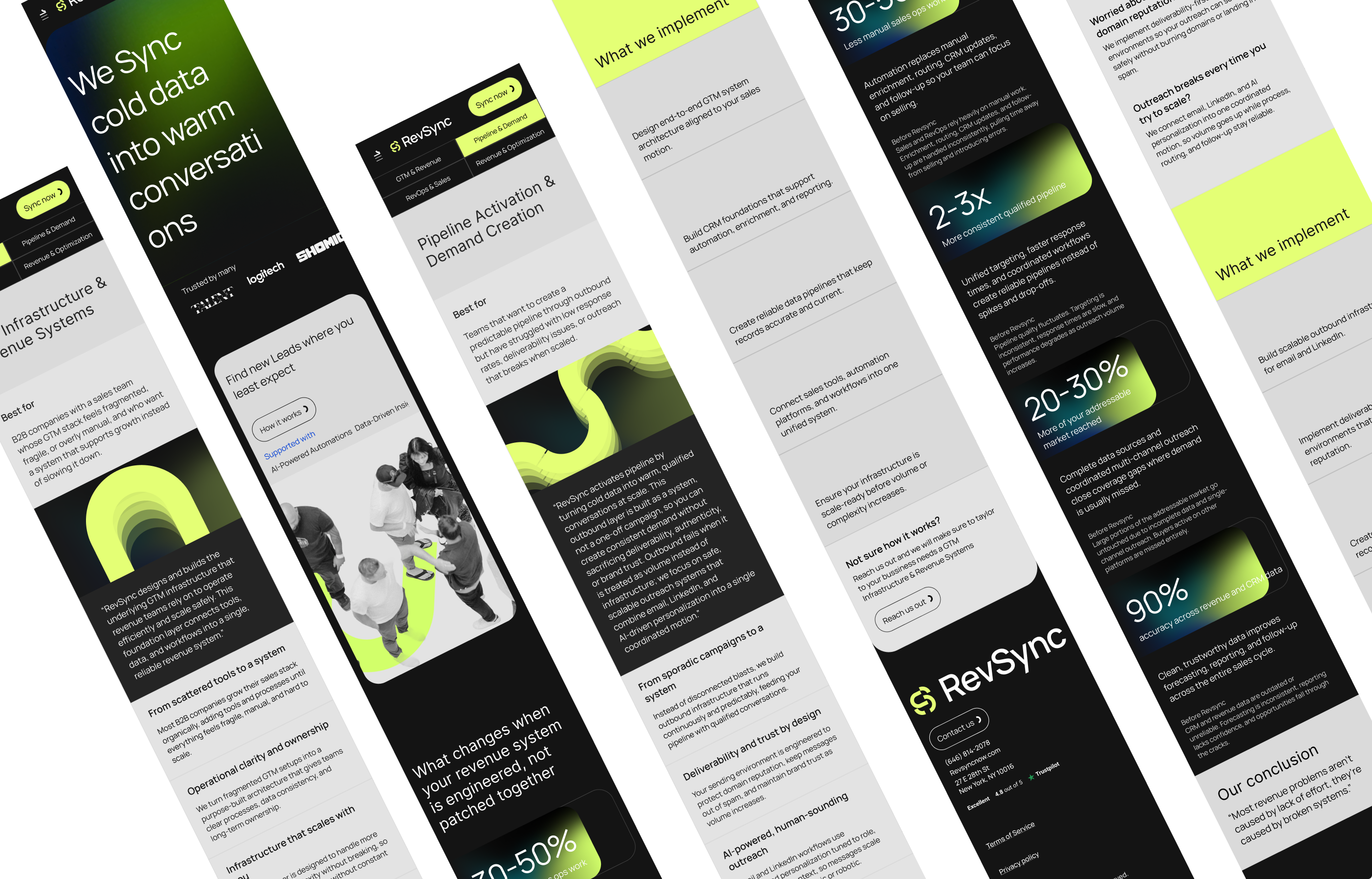
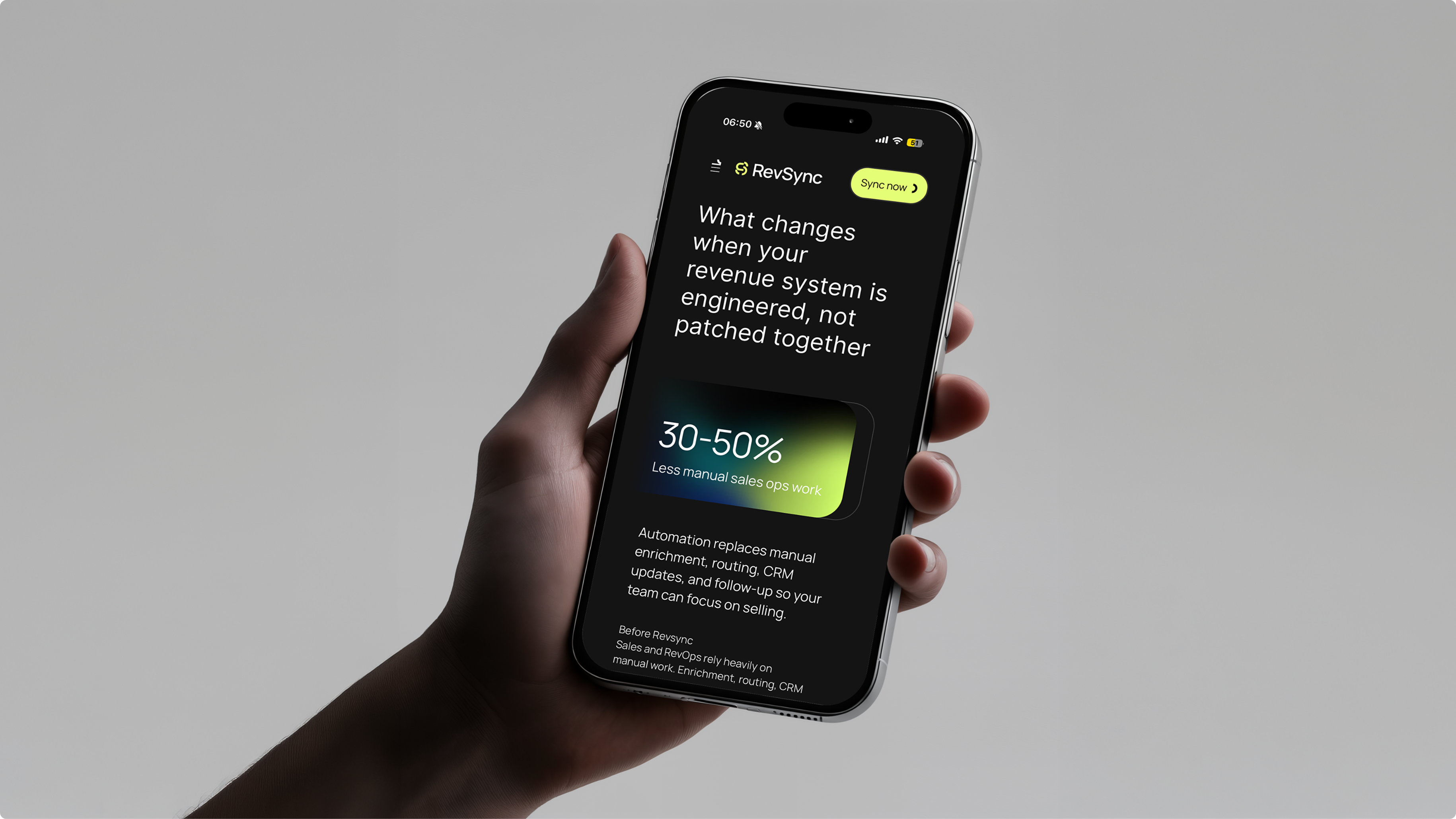
The central insight was that RevSync's entire value proposition mirrors a physical transformation: data starts cold (fragmented, inert, disconnected) and through RevSync's infrastructure it becomes warm — active conversations, qualified pipelines, meaningful revenue. This metaphor guided every creative decision that followed. Blue (cold, digital, distant) transitions into lime-green (alive, warm, connected). Fragmented shapes consolidate into solid forms. Typography doesn't just set text — it creates structural links between ideas, echoing the connective tissue RevSync provides for its clients' revenue stacks.
Visual Identity & Art Direction
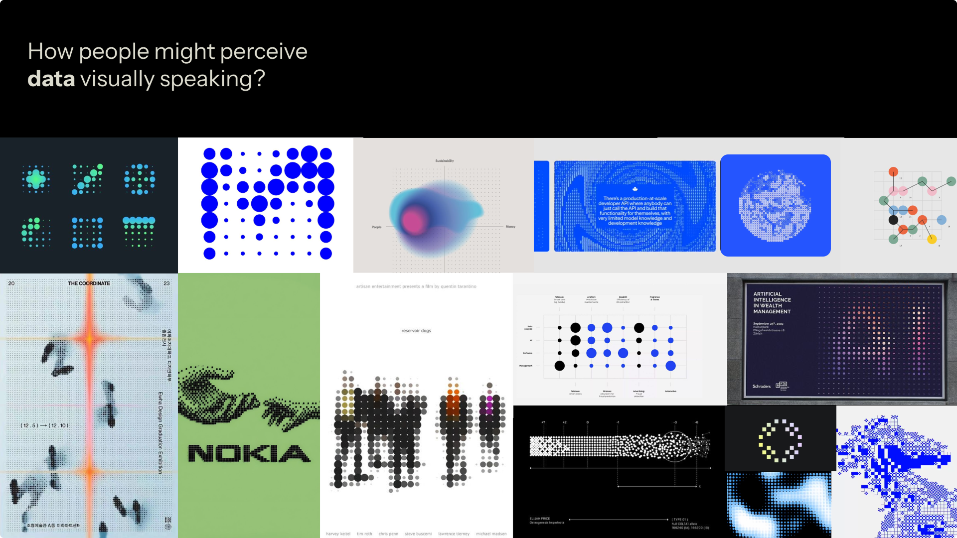
References were drawn from data visualization aesthetics, topographic mapping, and signal infrastructure — spaces where invisible data becomes visible form. The chosen typeface, Manrope, was selected for its modern geometric structure and its open-source nature, aligning with RevSync's ethos of transparent, scalable infrastructure.
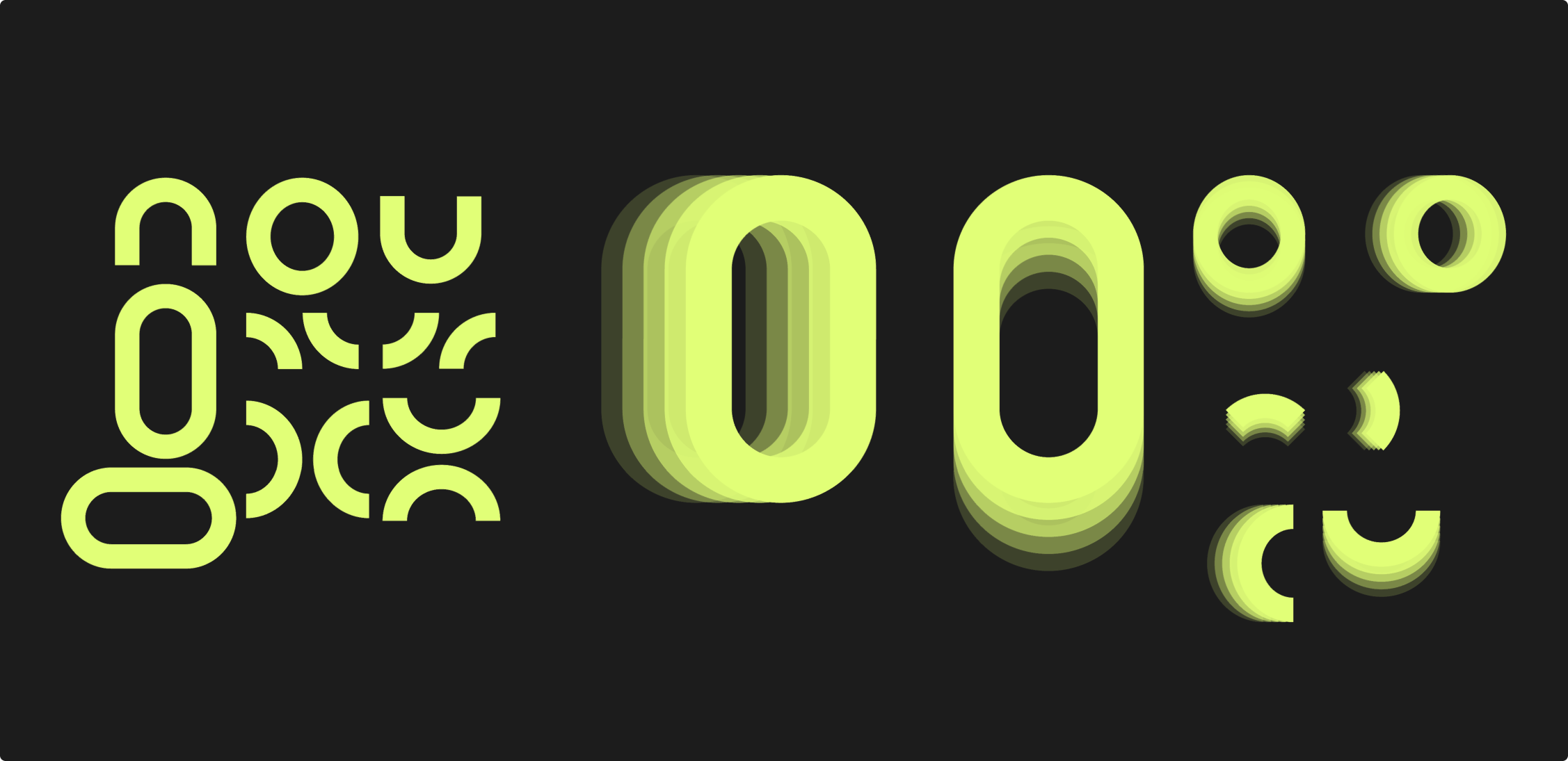
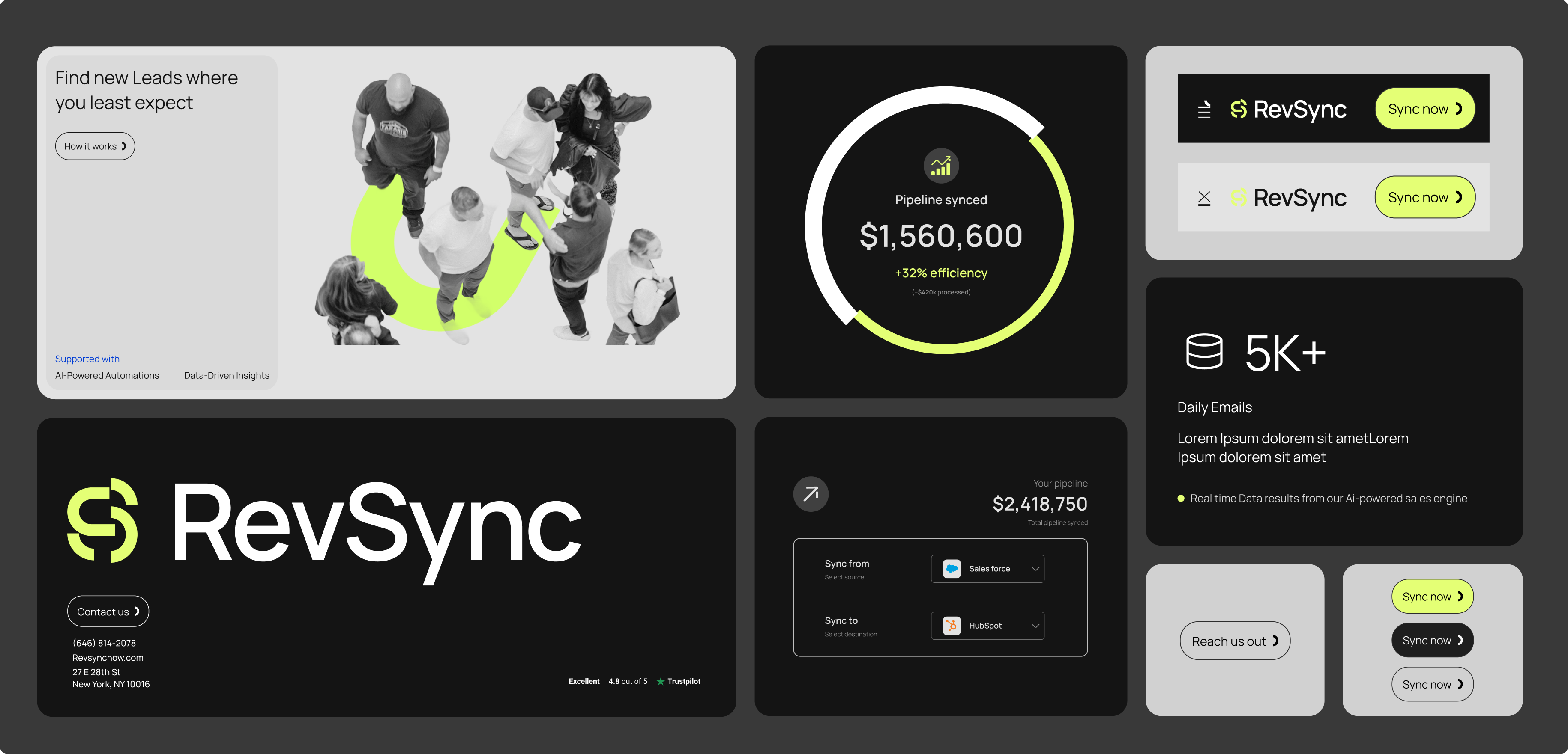
Critically, letterforms were used not just for readability but as visual anchors — the rounded "S" in the logo, the connected link shapes within infographic components — all reinforcing the brand's core metaphor. The color palette was deliberately kept narrow: full-black backgrounds, electric lime, cold blue, and solid white. No pastels, no gradients without purpose.
UX Architecture — Sitemap & Wireframes
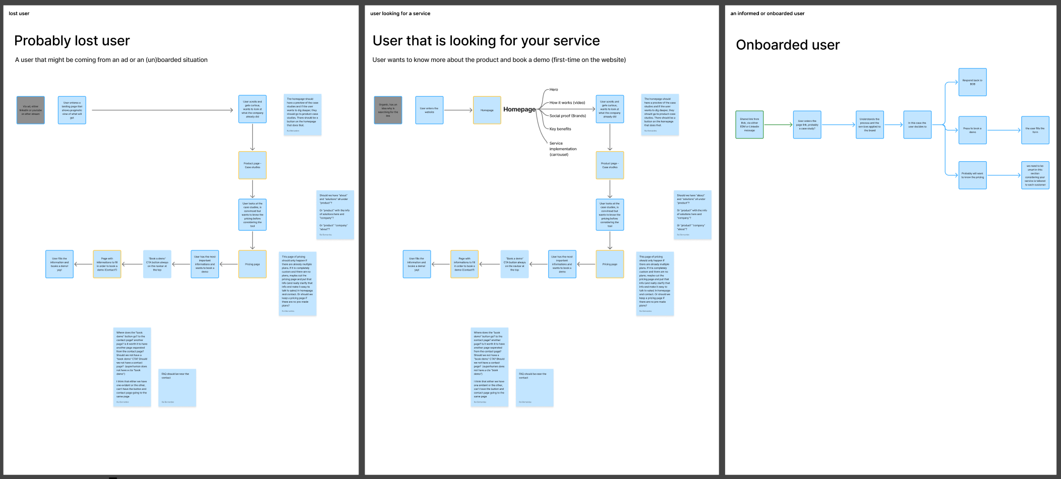
With the brand strategy locked, the site architecture was mapped: a website that understands what possible user scenarios we might be finding in the website?
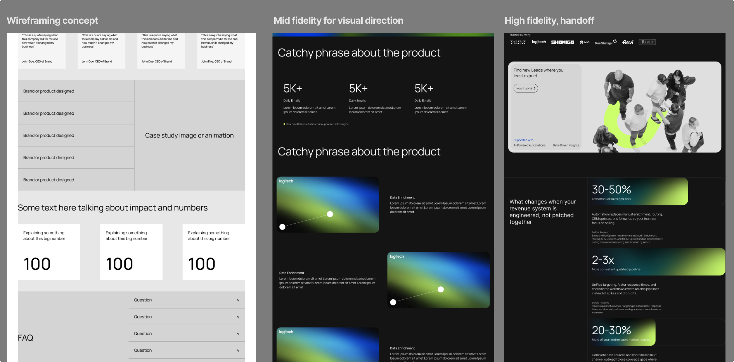
Mid-Fidelity Sign-off & UI Kit Build
A mid-fidelity version of the homepage was presented for stakeholder alignment before committing to production design. Once signed off, a complete UI kit was assembled in Figma: typography scale, component library, color tokens, icon set, and layout grids — all structured for direct use in Figma Sites. This stage also produced the brand's shape-link system: typographic elements that function as connective graphic forms, usable independently in infographics, slide decks, and social content.
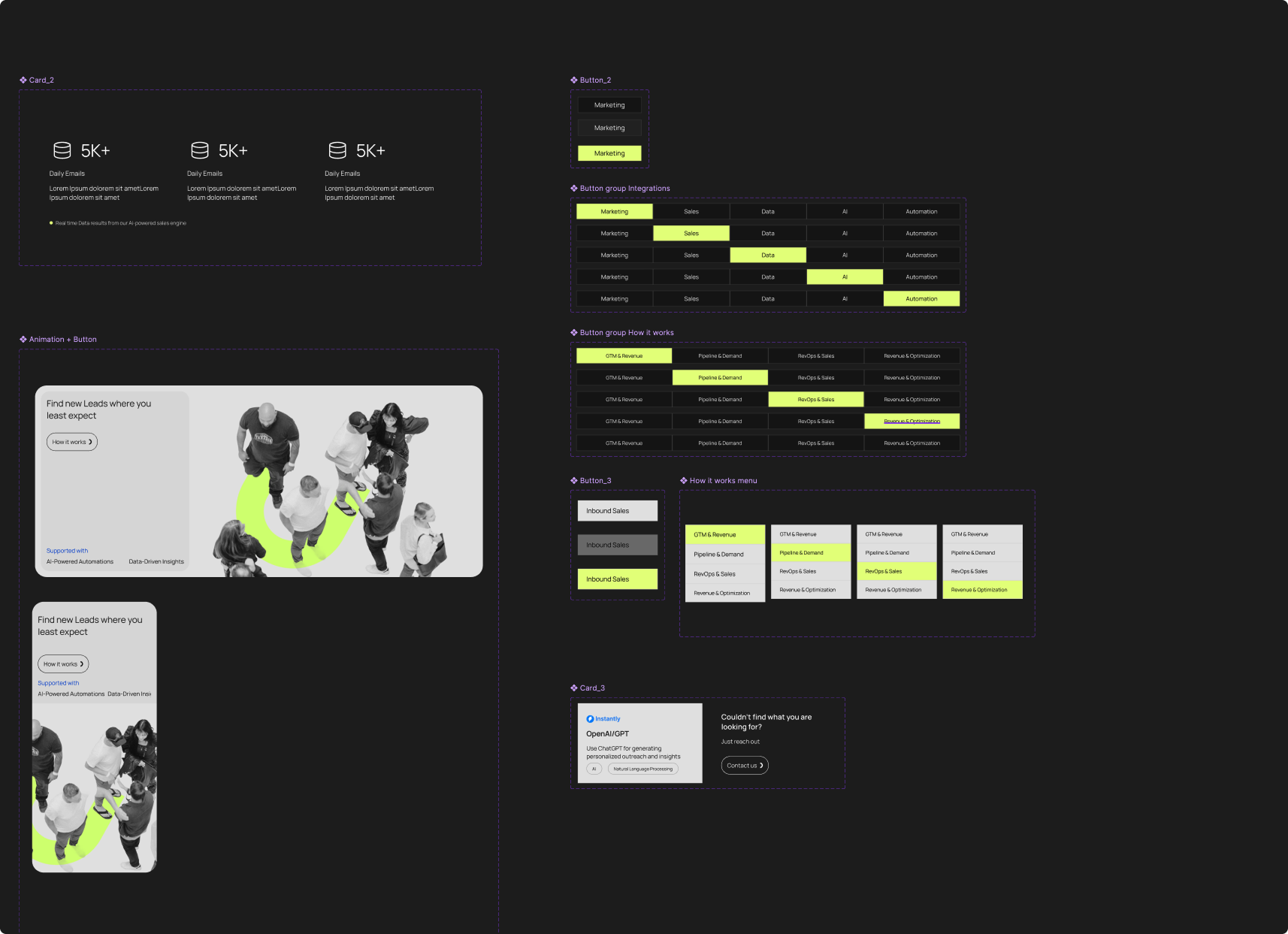
Production Build via Figma Sites + Tracking
The entire website was designed and implemented directly in Figma Sites — eliminating the traditional handoff gap between designer and developer. This approach allowed pixel-perfect fidelity between design intent and live output. The site is fully responsive across all breakpoints, from desktop to mobile, with dedicated mobile navigation states, collapsible components, and touch-optimized layouts. Analytics and event tracking were configured from day one, allowing performance data to be captured from the very first visitor.
A brand that performs as well as it looks

Success for a project like this isn't measured in a single moment — it's measured in trust accumulated across thousands of first impressions. RevSync's brand landed with the credibility and coherence of a company that has been operating for years, not one that just launched.
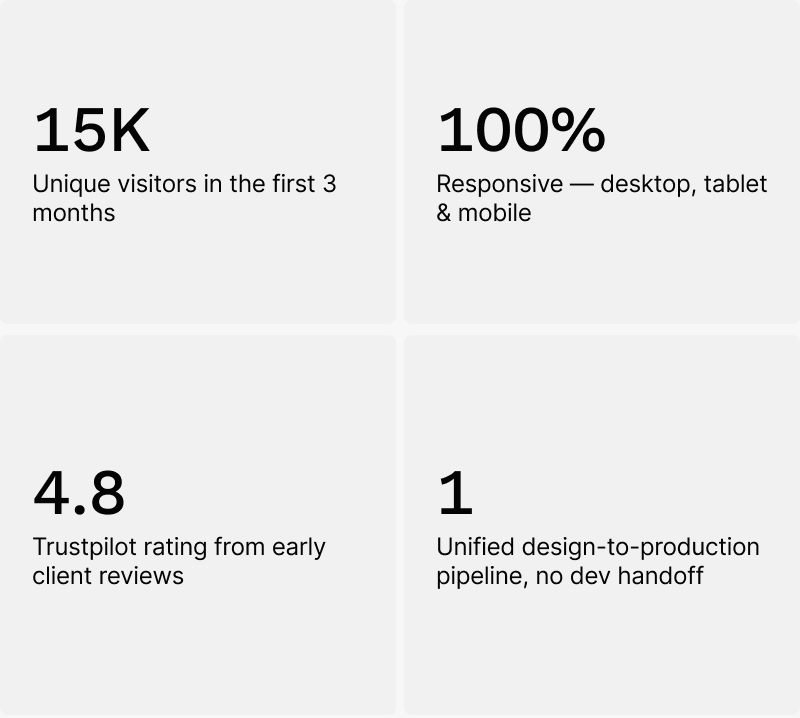
The 15,000 visitor milestone in the first quarter was significant not just as a traffic number, but as a validation signal. People who found RevSync organically stayed long enough to read, scroll, and explore multiple service pages — an indication that the narrative structure of the site was doing its job of guiding complex decision-making journeys.
Visitors consistently describe the brand as feeling "safe," "coherent," and "like they know what they're doing" — language that mirrors RevSync's own value proposition almost verbatim. That kind of alignment between brand perception and brand promise is the clearest possible signal of a visual identity working at its highest level.
"The first step is a Sales Infrastructure Audit, where we map your current setup, identify gaps, and show you where revenue is leaking before recommending anything." — RevSync, on how trust is earned
A 4.8 rating on Trustpilot from early clients reflects not just satisfaction with RevSync's service — but also confidence in the brand that made them reach out in the first place. A website and identity system that consistently converts the right conversations is the ultimate design success metric.
Finally a Review from the Client Project
★★★★★
"Did a full web design + Rebrand project for my business and I am extremely happy with the final output (I am a very picky person).
Rui was absolutely amazing, went above and beyond to understand my personal story and past experience before diving into my current business and crafting a new brand for it. This ensured that the branding expressed part of my personality instead of just using fancy colors or generic templates.
He also spent a bunch of time going through the reference websites I shared to incorporate the aspects of them that I liked. Creating logo iteration boards and walkthroughs, constantly providing updates on the situation.
If you are looking for a real designer/artist in this era where everyone uses GPT or AI to spin up designs, Rui is you guy."
Bob Xu · Revsync
...Could not be happier, also a big hug to Luiza Amorim for the brand/logo creation, that without her I could never had the chance to go so far with this project, team work makes the dream work!

Rui B
2026
Made in Porto

Handle with care

RevSync — Syncing cold data into warm conversations
Summary (“The short version, for the busy ones.”)
Designed the RevSync brand from the ground up:
-strategy, identity, visual language - using a cold-to-warm concept where blue fragments become lime-green solids.
Built the complete information architecture, wireframes, and mid-fidelity screens to align with stakeholders before moving to production. Created a full UI kit and implemented the final website directly in Figma Sites — fully responsive, production-ready, and fast. Set up additional performance tracking from launch day.
The site hit 15,000 unique visitors in its first 3 months. The visual system - especially the typographic "link shapes" - became the backbone of the brand's infographic storytelling across pages.
Complex infrastructure, invisible to the eye
RevSync operates in a space where the product is, by nature, invisible. There are no physical goods, no dashboards the user immediately experiences, no single compelling screenshot. What RevSync sells is architectural integrity — the confidence that your revenue infrastructure is not stitched together with spreadsheets and crossed fingers.
The core tension was this: the people who most need RevSync are the hardest to convince they need it. They're running teams, closing deals, managing inboxes. Telling them their "system is broken" when things are moving — even chaotically — is a hard message to land.
Design a brand that demonstrates systems thinking
The objective was clear but demanding: build a visual identity and website that didn't just describe RevSync's capabilities — it had to embody them. The brand itself needed to feel like a system: structured, coherent, scalable, and confident.
Specifically, the goals were:
Translate abstraction into a compelling visual metaphor
Cold data → warm conversations had to be visible in the brand, not just in the copy. Color, form, and motion all needed to carry that narrative.
Build trust from the first scroll
B2B buyers scrutinize credibility. The brand had to signal depth of expertise and professionalism before a single word was read.
Design a system, not a collection of pages
Every element — typography, spacing, shape language, color — needed to be reusable and scalable into infographics, presentations, and collateral beyond the website.
Deliver a production-ready website with measurable traffic
Beyond aesthetics, the deliverable was a fully working, responsive, tracked website — not a prototype handed to a developer.
From concept to production in five phases
The project was structured in deliberate phases — each one a gating checkpoint before the next. This wasn't arbitrary process; it was itself a demonstration of systems thinking applied to the design discipline.
Brand Strategy — the cold-to-warm concept
The central insight was that RevSync's entire value proposition mirrors a physical transformation: data starts cold (fragmented, inert, disconnected) and through RevSync's infrastructure it becomes warm — active conversations, qualified pipelines, meaningful revenue. This metaphor guided every creative decision that followed. Blue (cold, digital, distant) transitions into lime-green (alive, warm, connected). Fragmented shapes consolidate into solid forms. Typography doesn't just set text — it creates structural links between ideas, echoing the connective tissue RevSync provides for its clients' revenue stacks.
Visual Identity & Art Direction
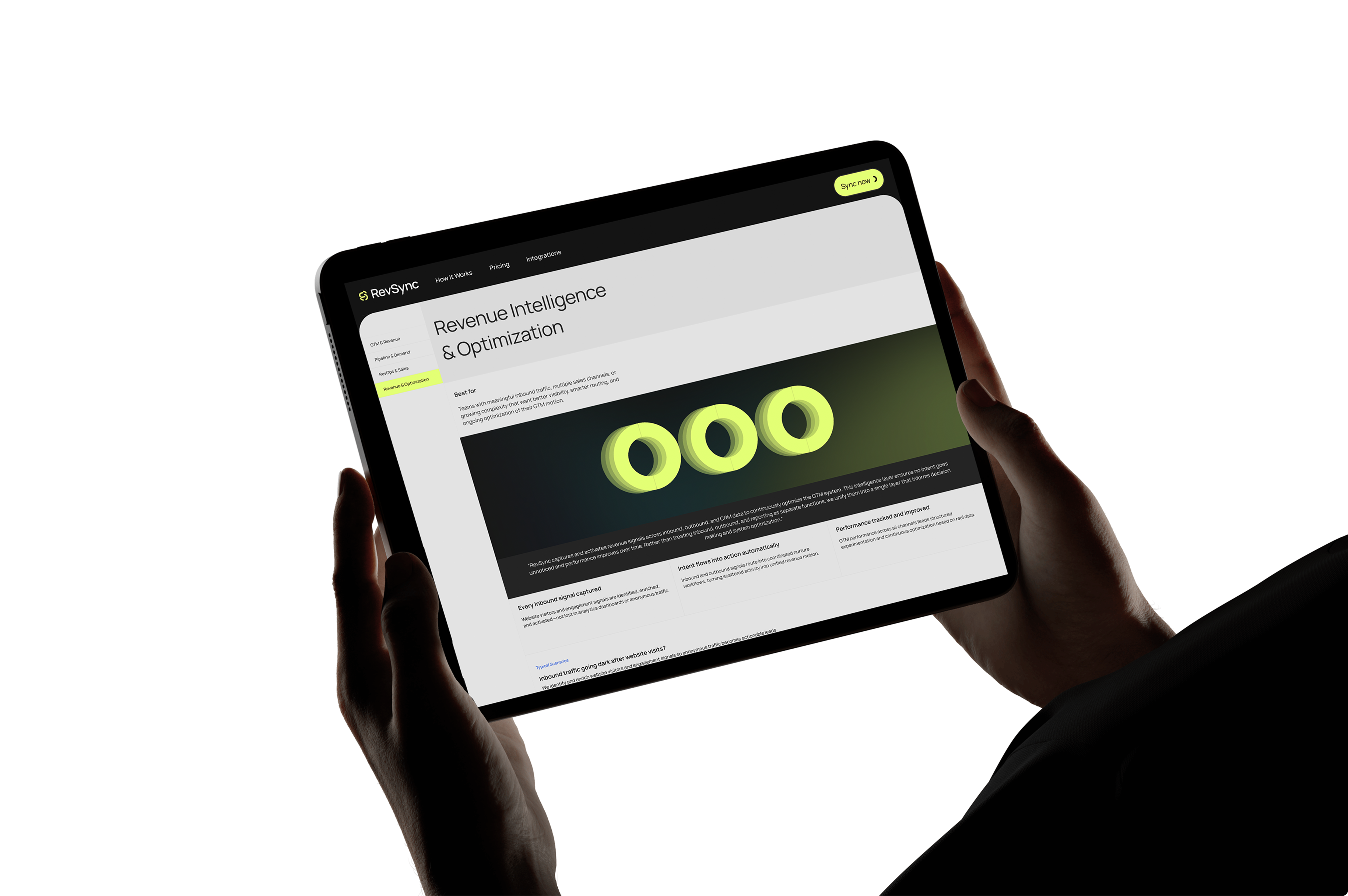
References were drawn from data visualization aesthetics, topographic mapping, and signal infrastructure — spaces where invisible data becomes visible form. The chosen typeface, Manrope, was selected for its modern geometric structure and its open-source nature, aligning with RevSync's ethos of transparent, scalable infrastructure.
Critically, letterforms were used not just for readability but as visual anchors — the rounded "S" in the logo, the connected link shapes within infographic components — all reinforcing the brand's core metaphor. The color palette was deliberately kept narrow: full-black backgrounds, electric lime, cold blue, and solid white. No pastels, no gradients without purpose.
UX Architecture — Sitemap & Wireframes
With the brand strategy locked, the site architecture was mapped: a website that understands what possible user scenarios we might be finding in the website?
Mid-Fidelity Sign-off & UI Kit Build
A mid-fidelity version of the homepage was presented for stakeholder alignment before committing to production design. Once signed off, a complete UI kit was assembled in Figma: typography scale, component library, color tokens, icon set, and layout grids — all structured for direct use in Figma Sites. This stage also produced the brand's shape-link system: typographic elements that function as connective graphic forms, usable independently in infographics, slide decks, and social content.
Production Build via Figma Sites + Tracking
The entire website was designed and implemented directly in Figma Sites — eliminating the traditional handoff gap between designer and developer. This approach allowed pixel-perfect fidelity between design intent and live output. The site is fully responsive across all breakpoints, from desktop to mobile, with dedicated mobile navigation states, collapsible components, and touch-optimized layouts. Analytics and event tracking were configured from day one, allowing performance data to be captured from the very first visitor.
A brand that performs as well as it looks
Success for a project like this isn't measured in a single moment — it's measured in trust accumulated across thousands of first impressions. RevSync's brand landed with the credibility and coherence of a company that has been operating for years, not one that just launched.
The 15,000 visitor milestone in the first quarter was significant not just as a traffic number, but as a validation signal. People who found RevSync organically stayed long enough to read, scroll, and explore multiple service pages — an indication that the narrative structure of the site was doing its job of guiding complex decision-making journeys.
Visitors consistently describe the brand as feeling "safe," "coherent," and "like they know what they're doing" — language that mirrors RevSync's own value proposition almost verbatim. That kind of alignment between brand perception and brand promise is the clearest possible signal of a visual identity working at its highest level.
"The first step is a Sales Infrastructure Audit, where we map your current setup, identify gaps, and show you where revenue is leaking before recommending anything." — RevSync, on how trust is earned
A 4.8 rating on Trustpilot from early clients reflects not just satisfaction with RevSync's service — but also confidence in the brand that made them reach out in the first place. A website and identity system that consistently converts the right conversations is the ultimate design success metric.
Finally a Review from the Client Project
★★★★★
"Did a full web design + Rebrand project for my business and I am extremely happy with the final output (I am a very picky person).
Rui was absolutely amazing, went above and beyond to understand my personal story and past experience before diving into my current business and crafting a new brand for it. This ensured that the branding expressed part of my personality instead of just using fancy colors or generic templates.
He also spent a bunch of time going through the reference websites I shared to incorporate the aspects of them that I liked. Creating logo iteration boards and walkthroughs, constantly providing updates on the situation.
If you are looking for a real designer/artist in this era where everyone uses GPT or AI to spin up designs, Rui is you guy."
Bob Xu · Revsync
...Could not be happier, also a big hug to Luiza Amorim for the brand/logo creation, that without her I could never had the chance to go so far with this project, team work makes the dream work!
Rui B
2026
Made in Porto
Handle with care

RevSync — Syncing cold data into warm conversations
Summary (“The short version, for the busy ones.”)
Designed the RevSync brand from the ground up:
-strategy, identity, visual language - using a cold-to-warm concept where blue fragments become lime-green solids.
Built the complete information architecture, wireframes, and mid-fidelity screens to align with stakeholders before moving to production. Created a full UI kit and implemented the final website directly in Figma Sites — fully responsive, production-ready, and fast. Set up additional performance tracking from launch day.
The site hit 15,000 unique visitors in its first 3 months. The visual system - especially the typographic "link shapes" - became the backbone of the brand's infographic storytelling across pages.
Complex infrastructure, invisible to the eye
RevSync operates in a space where the product is, by nature, invisible. There are no physical goods, no dashboards the user immediately experiences, no single compelling screenshot. What RevSync sells is architectural integrity — the confidence that your revenue infrastructure is not stitched together with spreadsheets and crossed fingers.
The core tension was this: the people who most need RevSync are the hardest to convince they need it. They're running teams, closing deals, managing inboxes. Telling them their "system is broken" when things are moving — even chaotically — is a hard message to land.
Design a brand that demonstrates systems thinking
The objective was clear but demanding: build a visual identity and website that didn't just describe RevSync's capabilities — it had to embody them. The brand itself needed to feel like a system: structured, coherent, scalable, and confident.
Specifically, the goals were:
Translate abstraction into a compelling visual metaphor
Cold data → warm conversations had to be visible in the brand, not just in the copy. Color, form, and motion all needed to carry that narrative.
Build trust from the first scroll
B2B buyers scrutinize credibility. The brand had to signal depth of expertise and professionalism before a single word was read.
Design a system, not a collection of pages
Every element — typography, spacing, shape language, color — needed to be reusable and scalable into infographics, presentations, and collateral beyond the website.
Deliver a production-ready website with measurable traffic
Beyond aesthetics, the deliverable was a fully working, responsive, tracked website — not a prototype handed to a developer.
From concept to production in five phases
The project was structured in deliberate phases — each one a gating checkpoint before the next. This wasn't arbitrary process; it was itself a demonstration of systems thinking applied to the design discipline.
Brand Strategy — the cold-to-warm concept
The central insight was that RevSync's entire value proposition mirrors a physical transformation: data starts cold (fragmented, inert, disconnected) and through RevSync's infrastructure it becomes warm — active conversations, qualified pipelines, meaningful revenue. This metaphor guided every creative decision that followed. Blue (cold, digital, distant) transitions into lime-green (alive, warm, connected). Fragmented shapes consolidate into solid forms. Typography doesn't just set text — it creates structural links between ideas, echoing the connective tissue RevSync provides for its clients' revenue stacks.
Visual Identity & Art Direction
References were drawn from data visualization aesthetics, topographic mapping, and signal infrastructure — spaces where invisible data becomes visible form. The chosen typeface, Manrope, was selected for its modern geometric structure and its open-source nature, aligning with RevSync's ethos of transparent, scalable infrastructure.
Critically, letterforms were used not just for readability but as visual anchors — the rounded "S" in the logo, the connected link shapes within infographic components — all reinforcing the brand's core metaphor. The color palette was deliberately kept narrow: full-black backgrounds, electric lime, cold blue, and solid white. No pastels, no gradients without purpose.
UX Architecture — Sitemap & Wireframes
With the brand strategy locked, the site architecture was mapped: a website that understands what possible user scenarios we might be finding in the website?
Mid-Fidelity Sign-off & UI Kit Build
A mid-fidelity version of the homepage was presented for stakeholder alignment before committing to production design. Once signed off, a complete UI kit was assembled in Figma: typography scale, component library, color tokens, icon set, and layout grids — all structured for direct use in Figma Sites. This stage also produced the brand's shape-link system: typographic elements that function as connective graphic forms, usable independently in infographics, slide decks, and social content.
Production Build via Figma Sites + Tracking
The entire website was designed and implemented directly in Figma Sites — eliminating the traditional handoff gap between designer and developer. This approach allowed pixel-perfect fidelity between design intent and live output. The site is fully responsive across all breakpoints, from desktop to mobile, with dedicated mobile navigation states, collapsible components, and touch-optimized layouts. Analytics and event tracking were configured from day one, allowing performance data to be captured from the very first visitor.
A brand that performs as well as it looks
Success for a project like this isn't measured in a single moment — it's measured in trust accumulated across thousands of first impressions. RevSync's brand landed with the credibility and coherence of a company that has been operating for years, not one that just launched.
The 15,000 visitor milestone in the first quarter was significant not just as a traffic number, but as a validation signal. People who found RevSync organically stayed long enough to read, scroll, and explore multiple service pages — an indication that the narrative structure of the site was doing its job of guiding complex decision-making journeys.
Visitors consistently describe the brand as feeling "safe," "coherent," and "like they know what they're doing" — language that mirrors RevSync's own value proposition almost verbatim. That kind of alignment between brand perception and brand promise is the clearest possible signal of a visual identity working at its highest level.
"The first step is a Sales Infrastructure Audit, where we map your current setup, identify gaps, and show you where revenue is leaking before recommending anything." — RevSync, on how trust is earned
A 4.8 rating on Trustpilot from early clients reflects not just satisfaction with RevSync's service — but also confidence in the brand that made them reach out in the first place. A website and identity system that consistently converts the right conversations is the ultimate design success metric.
Finally a Review from the Client Project
★★★★★
"Did a full web design + Rebrand project for my business and I am extremely happy with the final output (I am a very picky person).
Rui was absolutely amazing, went above and beyond to understand my personal story and past experience before diving into my current business and crafting a new brand for it. This ensured that the branding expressed part of my personality instead of just using fancy colors or generic templates.
He also spent a bunch of time going through the reference websites I shared to incorporate the aspects of them that I liked. Creating logo iteration boards and walkthroughs, constantly providing updates on the situation.
If you are looking for a real designer/artist in this era where everyone uses GPT or AI to spin up designs, Rui is you guy."
Bob Xu · Revsync
...Could not be happier, also a big hug to Luiza Amorim for the brand/logo creation, that without her I could never had the chance to go so far with this project, team work makes the dream work!
Rui B
2026
Made in Porto
Handle with care